Friday, September 30, 2005

Typogenerator--Fun!

While reading a blog written by someone who makes ATCs, I learned of this fun website. (Sorry, I forgot to write down the blog name!)

I found out about this fun and cool (and free) website:
www.typogenerator.net.

This is fun to play with if you have time to spare.

You type in a word then run the program. It searches google images site for images linked to that word, and it uses text found for that word also. It uses a computer program to scramble the images and words and changes the colors, for a collage effect. You never know what will turn up. You can do more than one try for each keyword if you want or ask it to make a new image over and over with the same background, etc.

I played with this a few weeks ago. I saved some of my favorites to my hard drive by using the mouse's right button to click on the image and following the usual procedure for saving a document.

With homeschooling the world is the classsroom

I loved that with the (just the) keyword "Homeschooling" a map image came up. This made me think "with homeschooling the world is the classroom".

Anyway, it is inspiring for those of us who like to get some ideas for collage-making.

Wednesday, September 28, 2005

Made Some "Produce" ATCs on Saturday and Sunday

Last Saturday we had a busy morning going to a typical country fair in New England. I decided to spend some time relaxing and making some ATCs for a swap I am participating in about "produce" and the harvest.

I also spent time on Sunday afternoon making more "produce" ATCs.

I decided to use an old seed catalog that I had actually saved since 2003. Please note that I had recycled the 2004 and 2005 catalogs in the name of trying not to be a packrat. I don't know how the 2003 catalog was saved but I was happy about it. This catalog is excellent for decoupage and ATCs. It is from a seed company called Shumway's. All of the illustrations are done in the old fashioned ink style hand drawsings. Some of the illustrations are in color and are on glossy paper. Most of the catalog is on newsprint with black line illustrations. The images are gorgeous and are for vegetables, fruits, and herbs. If you want this catalog I am sure you can sign up to receive one, on their website. My catalog usually arrives the week after Christmas. I only receive one per year.

I made various collage ATCs using cutouts from the Shumway's catalog. Each page has a nearly-life sized tie photograph on it. I also used an old Hermes tie catalog that I saved to use in collage artwork with my children.

I made my first hand drawn ATC by trying to copy an illustration from the seed company. It was with black pen on a white background. I decided to spruce it up with colored crayons.

For the first time I used mini rubber stamps for letters to spell words. I also was inspired by the way I clean my rubber stamps, to randomly stamp blank ATC background cards with the used stamps until the ink was all gone. This made an interesting effect.

I colored in one black and white image with my favorite colored pencils (Berol Prismacolor).

Some of the ATCs I loved while others were mediocre. I had to make nine for this swap. Somehow I lost track and actually made 12.

I will post photos when I have time.

Stayed Up Late Making ATCs

The other night I had a meeting in my home. I was then wide awake (and happy) and decided that rather than go watch TV in bed or read a book, I'd take advantage of the alone time and make some ATCs for a swap.

The swap is called, "Vintage, Pen, Paper and Ink" and requires the use of vintage papers such as receipts, lists and letters.

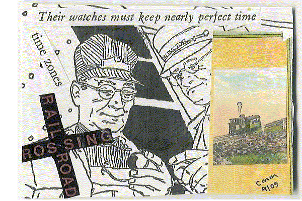
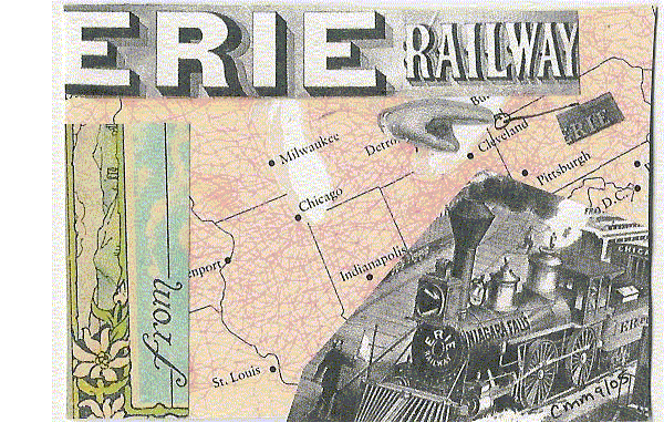
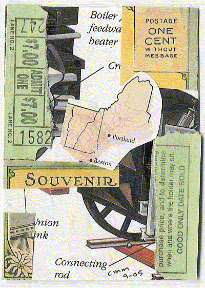
I am using old papers from my great-grandmother, grandmother and my grandfather. I made collages out of the papers.

I was not happy with some of the ones that I had made for this swap, previously. The problem is that I was using a lot of old lists (on white paper) and on old cash register receipts. Therefore the collages had either a lot of white or a lot of yellowing old paper color (read: boring).

I decided to try and spice up some of the old ones.

On one card I used acrylic paint mixed with water to make the paint more transparent. I painted over some of the white papers. I didn't think this looked very good or interesting. Oh well.

On another card I colored different segments with chalk pastels. I then used water on a paintbrush on top of that to make the color more deep. It looks very much like paint.

I then went to my box of papers and began looking at bunches of receipts and lists from the 1970s. I was thinking about how the papers were mostly white and boring. Then I noticed that some papers were colored. I had the idea to make a rainbow type of design.

I didn't have any red papers but I had about every other color of the rainbow plus pink. I layered the paper on a vertically positioned ATC and made stripes of rainbow colors. Due to the size of the ATC each layer was only about 1/2 inch high.

I liked that card so much that I made a second one.

I then had an idea to make a picture out of the papers. This idea came from looking at a green bank envelope and thinking it was the same color as a flower stem. I then selected a background card I made last month, with watercolor paints on watercolor paper. The color of the background was a dark pink. Using freehand scissor cutting I fashioned a stem and leaves. I chose a black color for the center of the daisy-shaped flower. I used a pale pink auto repair receipt from 1975 for petals. At first I tried drawing the petals and cutting them out but that was a pain in the neck so I just cut them freehand. I then glued down the papers and I loved the ATC so much that I decided to keep that one. By the time I finished that one it was nearly 1 in the morning and I was dead tired (or else I would have made a whole series of these flowers).

Saturday, September 24, 2005

Today I found this blog. The artist is painting aerial maps of certain places. It seems to me that she may be using the internet's images of aerial photos then making her own rendition of them using paints. The ATCs are labeled with the name of the places they represent. Go check them out!

This sounds like a great project. Even me, with my little talent, could paint something like this! I may try this soon!

Tuesday, September 20, 2005

Thoughts on some other people’s ATCs

I have been looking at other people’s ATCs on the web. I am amazed at the variety out there. I am in awe of the artists who do hand drawn ATCs.

I have been impressed by some of the images that I see, such great vintage photos and wonderful postage stamps. However, I found out that some of them are actually reproductions as printed on papers sold in the scrapbooking sections of craft stores. I was less impressed at that point. Call me a snob if you want to. I like the idea of an actual old postage stamp being used instead of a photocopy.

I see quite a number of people using embellishments. I am wondering where I can buy some of these, locally. I do see some internet stores selling them. They are not expensive but they are too much to spend on a small purchase with a shipping fee larger than the cost of the item. Then again, I am trying to make ATCs out of things I already own rather than buying items to use.

I don’t see many people using current magazine cutouts for collage. I see vintage magazine cutouts being used. Some of my first ATCs were made with cutouts from magazines I had around the house. I guess I am doing things differently than other people. My first thought was that I should change my method. I am trying to not be swayed by other people. Art is not necessarily about following the crowd. I am sticking to doing what I want with the materials I have on hand. This is about having fun, not feeling weird for not conforming with the masses.

I also realize that a number of ex-scrapbookers or current scrapbookers are now doing ATCs. I have seen ATCs that use embellishments intended for scrapbooking on the ATC. Some of the ATCs are only a collection of these such things. I find this interesting.

I love that we can all do our own thing. Art for art’s sake. I do hope people enjoy my ATCs, though.

With this said, I have a swap due in four days and need to get working on it. Homeschooling and mothering my children has taken priority and I have been concentrating on that. But with a deadline looming it is time to get creating. Maybe I will stay up late tonight and do it while everyone else is sleeping.

I sent in a swap that had to include a number on the ATC. I scanned the ATCs and will post them when I can.

I have yet to receive my first swap, the train themed swap. It should be here any day now. I can’t wait to see the ATCs that I receive!

Thursday, September 08, 2005

"East Meets West" ATC: Series: Riding the Rails


"East Meets West". #1 in a series of 8 for a swap for the Yahoo Group! "artisttradingcards", titled "Riding the Rails". Created 9/8/05. Original. Collage with embellishment of a metal lock.

The background is a page of text about trains.

The image is a copy of a little collectible trading card which I believe came in breakfast cereal, sometime in the 1970s. Note the not-policitally correct and not-historically correct image of a Native American watching the celebration of the two trains coming together. I don't believe this really happened. I say this is not-politically correct as I believe that Native Americans were very upset about the railroad and they would never have watched in the crowd like that. At least he is frowning.

The embellishment came with a bag of bargain buttons from the craft store, which I purchaed a few years ago and have been using to make crafts with my children. The lock is to symbolize the east and west coming together with the transcontinental railroad. I would have preferred tha the lock be opened but I was worried that if I cut it with a metal snipper that the edges would be sharp. I added the embellishment as I felt that it looked too plain without something else added to it.

"Wave at the Engineer" ATC: Series: Riding the Rails


"Wave at the Engineer". #2 in a series of 8 for a swap for the Yahoo Group! "artisttradingcards", titled "Riding the Rails". Created 9/8/05. Original. Collage.

The background text is from a book about trains. I am not sure you can read it on this scan, but the original is very readable.

The image and words "Wave at the Engineer!" is from a model train catalog.

The other words are from other train books.

"Oilman" ATC: Series: Riding the Rails


"Oilman". #3 in a series of 8 for a swap for the Yahoo Group! "artisttradingcards", titled "Riding the Rails". Created 9/8/05. Original. Collage.

The background photo is from a book which is a biography of the man who is holding the oil can, who was actually an engineer of a steam locomotive. I loved that photo! The white and black illustration is from a children's book about trains and is a small piece of an illustration of a steam locomotive. The words are from an index of a children's book about trains and contains references to the job of keeping the wheels oiled.

I toyed around with bringing color into the collage but it just didn't look right. I decided to keep the collage only in black and white colors.

"Telegraph Man" ATC: Series; Riding the Rails


"Telegraph Man". #4 in a series of 8 for a swap for the Yahoo Group! "artisttradingcards", titled "Riding the Rails". Created 9/8/05. Original. Collage.

The background with images in pastel green and pastel pink are from a book which is an atlas of railroads in America. It is a timeline that shows the train companies and how they changed over time. The small box contains statistics, from the same book, about employees and costs associated with running a railway. The image of the telegraph man with the train in the background was taken from the same atlas. The two themes here were railroads as businesses and showing one type of important railroad employee who didn't actually work on the train (the telegraph man). I also liked that we see a train in the background.

I thought the blend of black and white and color was a good balance. I had tried to use colored images where the telegraph man is now located but it looked too cartoonish and too pretty.

"Their watches must keep nearly perfect time" ATC: Series: "Riding the Rails"


"Their watches must keep nearly perfect time". #5 in a series of 8 for a swap for the Yahoo Group! "artisttradingcards", titled "Riding the Rails". Created 9/8/05. Original. Collage.

The background illustration is from a children's book about the history of railroads. I loved this image. I snipped the caption from the illustration and put it at the top.

At first I put a cutout of a steam locomotive on the right side, but it ripped. I couldn't fix it or remove it so I had to cover it up. I was worried if I kept it there ripped, that the ATC would be considered of poor quality and I didn't want to disappoint the person who received this ATC for the trade. I had a hard time finding an image that would fit there but not be so large as to detract from the main background illustration. I decided to use the small image of the train, which is an antique postcard from about 1925 and shows what we now call the Mt. Washington Cog Railway in New Hampshire. That image was too small to fit there, as I had cut it out to try to use elsewhere previously. I ended up pieceing background colors from another part of the antique souvenir postcard book there, to block out the steam locomotive. I then glued the little train image on top.

I saw the railroad crossing image in the model train catalog and felt I should use it on one of the ATCs for this series so placed it on this one.

The last thing I did was add the phrase "time zones", which was cut out from the index of the same children's book that the background illustration came from.

"From Erie" ATC: Series: "Riding the Rails"


"From Erie". #6 in a series of 8 for a swap for the Yahoo Group! "artisttradingcards", titled "Riding the Rails". Created 9/8/05. Original. Collage.

I started this ATC with the very colorful background which shows in colored lines, where the railroad tracks were at some point in time. This came from a railroad atlas.

The railroad atlas had an antique illustration. I cut one steam locomotive out of that illustration. I realized it was from Erie and that it mentioned Chicago. I placd it on the ATC so that the map still showed the area where Erie was and also where Chicago was.

I had to use a map to see where Erie is so I wouldn't block it out.

I loved the artistic way the words "Erie railway" were written and wanted to use them in some way, so put it at the top, where it would not block out Erie or Chicago.

The hand was from that same illustration. I decided to use the hand as a pointer to point to where Erie was. I was going to leave it that way, but then I thought maybe no one would realize the finger was pointing to Erie on the map, so I circled it and wrote Erie in my handwriting. I later cut the word "Erie" out of another area on the same illustration and glued it on top of my handwriting.

I thought the card was done.

Later I was working on another ATC and was working with an antique souvenir postcard booklet. I saw the word "From" on it and loved the font as well as the flower illustration that was above the word "From". I decided to use it on this ATC, as the train was from Erie, but went other places (such as Chicago). I placed it so that it would read "From Erie". I thought the colors in the flowers and the background made a nice balance of colors.

I then thought I should take off the word "Railway" so it would just say "From Erie", and tried to, but it was ripping the background so I glued it back down.

"Jacob's Ladder: Mt. Washington Railway" ATC: Series: Riding the Rails


"Jacob's Ladder: Mt. Washington Railway". #7 in a series of 8 for a swap for the Yahoo Group! "artisttradingcards", titled "Riding the Rails". Created 9/8/05. Original. Collage.

This collage began with a map which is actually an atlas of where railroad lines were on a certain date. I chose New England to put on the ATC as that is where I live.

I had this postcard from about 1925 and loved this illustration, of the Mt. Washington Railway which we now call the "Cog Railway". I decided to use it on this ATC. I placed it such that New Hampshire would still show.

I loved the font of "Purchase Tickets" which came from the same black and white illustration I used in my ATC titled "From Erie". Since Mt. Washington Cog Railway is a tourist destination I thought this sounded good here, to purchase tickets to ride the train. The only way I could fit this phrase onto the card and not block the map was to put it on a diagonal. Unfortunately it didn't quite fit so the "P" got cut off, that was unintentional. I wanted to make sure that New Hampshire still was visable.

I didn't like the upper left hand corner showing a bit of the map so I wanted to cover it up. I used a flower illustration from the same postcard booklet in that spot.

I was going to change the title to "Purchase Tickets" but I had already written the info on the back of the card and was rushing to finish it to get it in the mail for the deadline.

I love this ATC, because of the colors and the antique illustration of the train, the flower, and thelovely font of "puchase tickets". This is my favorite one in the series. I hope the new owner enjoys this!

"Souvenir" ATC: Series: Riding the Rails


"Souvenir". #8 in a series of 8 for a swap for the Yahoo Group! "artisttradingcards", titled "Riding the Rails". Created 9/8/05. Original. Collage.

The background of this ATC is from a children's book which shows cross-sections of trains. When I chose this background I had no other ideas about the creation of this ATC. I was worried a bit about the illustration showing large sections of black and worried this may be too dominating.

I loved the colors and font of the one cent postage and decided it would fit well on this ATC. This came from an antique souvenir postcard booklet from Mt. Washington Railway from about 1925; this was owned by my grandmother until she gave it to me last week. I put it on there but still had no concept for the ATC.

The two tickets are actually from the Shoreline Trolley Museum in East Haven, Connecticut, from a ride I took with my children there last month. These are the stubs which I found in my pocket and had tossed on the counter. I noticed them there when I was creating these ATCs and realized I could/should use them for these ATCs. I liked what each side said so decided to rip them apart and to use each side on this ATC. I then realized that I could make this about the Mt. Washington Cog Railway. Because Mt. Washington Railway is a tourist destination and one must buy a ticket like this to ride it, although in real life in present day the Mt. Washington Cog Railway in New Hampshire is much more than $7 per person to ride! Using these hid some of the black parts of the illustration.

Next I added the word "souvenir" which was from the postcard booklet. I loved the colors. I thought also that a person could save ticket stubs as a souvenir.

I needed something else with color to put here so I cut a small section of the railroad atlas map, which shows the state of New Hampshire, and added it, since this now had a Mt. Washington Cog Railway tourist destination theme. I Kept Maine due to the pretty shape of it.

Lastly, I added the small flower illustration which also was from the postcard booklet.

I really like this card, it is my second favorite card in the series.

As you may be able to tell, I love antique postcards!