Title: "Smack!"
 Title: "Say That's Pretty Good"
Title: "Lucy Perplexed"

Title: "Linus Map"

Title: "Charlie Brown and Lucy"
Technorati Tags: artist trading cards.
Title: "Say That's Pretty Good"


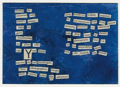
The main image of the woman laughing is from a DKNY ad. I started with that.
The image of the man is from the Wall Street Journal. He looked very stark and grey from the shade of the newspaper so I added distressing ink from Ranger to darken it.
It still looked very bright so I rubbed sandpaper over the image of the woman, then used the Ranger distressing ink on top.
A top coat of Golden acrylic gel medium in soft gloss was added. The scan of the postcard shows little lines and those are just the lines of the clear gloss sealer. I wanted to seal it so that it would be more durable in the mail.
The size is approximately 4x6 inches.
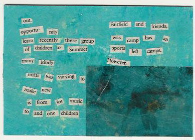
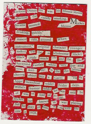
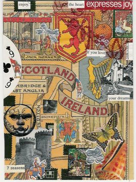
This was for a swap-bot swap. You can read more about the rules and how the poem's words were found in my other blog entry, here.
Technorati Tags: collage, mail art, swap-bot, postcard swap.

 2. Background is acrylic paint, hand painted. Rubber stamped images of the leaf and the number.
3. Background is acrylic painted. Image is from a tourist brochure and is a quick gel medium transfer. Number one is rubber stamped. Ink edges the border.
 4. Tree image is a citrasolv transfer from a newspaper advertisement image, onto white cardstock. Number one is a rubber stamp. Cropped and placed on a background of black gesso'ed cardboard (recycled box).
 6. Background is hand painted with watercolor paints on watercolor paper. Rubber stamped images of sun with ink. Cropped and placed on background of handmade paper. Number one is again, a rubber stamp.
 7. Background is hand painted with acrylic paint. Flower image by Hero Arts rubber stamp. Nubmer one is a rubber stamp. Light border coloring is ink from a rubber stamp pad.
 8. Background is hand painted with acrylic paint. Leaf image and number one is a rubber stamp. Edged with color from ink pad.
 9. Packing tape transfer of image of man from a tourist brochure (this is William Gillette the actor and builder of Gilettte's Castle in Connecticut). Bacgkround is hand painted with acrylic paint. Number one and text is rubber stamped images.